


What is CAM software? CAM software explained

CloudNC
June 2, 2026

How to reduce CNC programming time: 6 proven methods
CloudNC
May 29, 2026

The AI-ready shop: how to prepare your CNC operation for AI CAM when 80% of your competitors are not
CloudNC
May 27, 2026
2026 CNC machinist hiring crisis: what shop owners can do now
CloudNC
May 26, 2026

Predictive maintenance for CNC machines: reducing unplanned downtime
CloudNC
May 13, 2026
What is a CAM copilot? The definitive guide to AI-assisted CNC programming in 2026
CloudNC
May 7, 2026
AI-assisted CAM vs Feature-Based Machining
Carl Caldwell
April 10, 2026
How AI reduces CNC setup time
CloudNC
April 9, 2026

Why we don’t automate CAM programming
Theo Saville
April 2, 2026

Will robots take my CNC job?
CloudNC
March 24, 2026

How to Solve the CNC Machinist Shortage in 2026: The AI Approach
Norval Scott
March 18, 2026
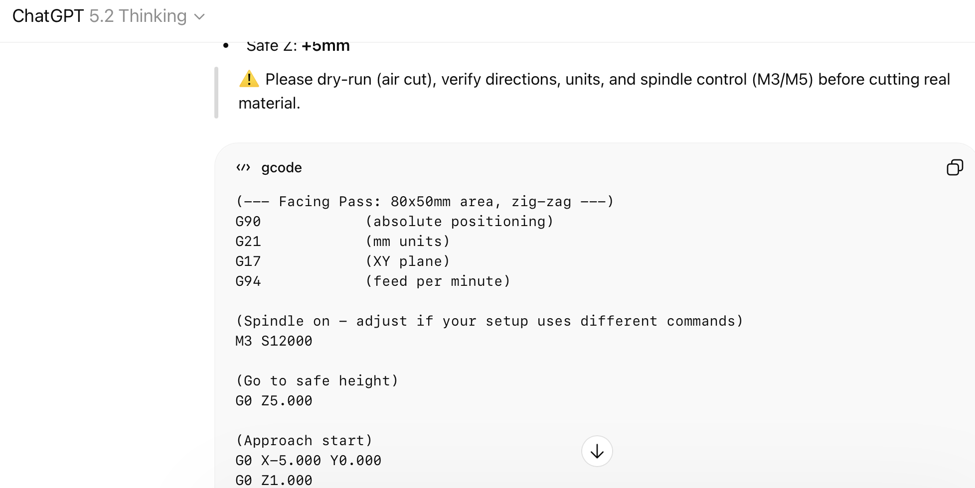
Can I use ChatGPT for generating G-code?
CloudNC
March 4, 2026